Omni Design System

Scalable design foundations for a multi-product, AI-integrated platform

Company

Annalect

Role

Lead UX/UI Designer

Duration

3 months

%

Improved Operational Efficiency

%

Improved Operational Efficiency

%

Accessibility Compliance

%

Accessibility Compliance

%

Reduced UI-Bug Reports

%

Reduced UI-Bug Reports

Overview

I led 2 designers in creating a design system for the Omni platform - a complete end-to-end MarTech platform consisting of over 15 core applications. The existing design system was incomplete, and had many inconsistencies. The aim of the new design system was to fix these issues, as well as make it more scalable, and increase adoption from across the organisation. This case study goes through the whole process from planning to deployment and outcomes.

My Role

As the lead designer, I was responsible for the end-to-end strategy and execution of the new design system. My role spanned audits, stakeholder interviews, designing the visual language, component architecture and documentation standards. I collaborated closely with developers to ensure seamless integration into our codebase and partnered with product to align the system to the evolving business needs.

Key Contributions
  • Led a comprehensive UI audit across multiple products to identify inconsistencies, redundancies, and legacy patterns, which resulted in a prioritised roadmap.

  • Mapped component usage across teams to find high-impact areas for standardisation and uncover edge cases that required flexible design solutions.

  • Created a phased implementation plan with clear milestones for token definition, component migration, documentation, and team onboarding.

  • Established scalable design tokens and component libraries in Figma and Storybook.

  • Created a governance model for contribution, versioning and adoption across teams.

  • Championed accessibility and responsiveness standards.

  • Partnered with engineering to prototype and validate component performance across platforms.

Problem

  • Designers and developers would bypass the existing system due to usability gaps or lack of trust which resulted in duplicated efforts, inconsistent UX, and wasted resources.

  • Missing usage guidelines, examples, or rationale for components resulted in confusion, misuse, and low onboarding success.

  • Figma libraries out of sync with codebases caused visual and behavioural inconsistencies across platforms.

  • No clear ownership or approval process for updates and additions.

Goals

  • Speed up development: Reduce the time from design to development.

  • Enhance scalability: Enable the rapid growing and evolving needs of the Omni platform.

  • Ensure consistency: Create a unified design language, and comprehensive principles and guides to create alignment across products and touchpoints.

  • Improve accessibility: Make all components be at least WCAG 2.1 AA standard.

Process

Discovery & Research

Interface & Accessibility Audit

Conducted a comprehensive audit of existing UI components, patterns, and styles across products to identify redundancies, inconsistencies, and accessibility gaps. This included cataloguing visual and interactive elements, assessing alignment with WCAG standards, and flagging areas that require inclusive design improvements. The findings informed prioritisation and ensured accessibility was embedded from the outset.

Benchmarking & Gap Analysis

Evaluated mature design systems (e.g., Material, Carbon, Polaris) to identify best practices in architecture, governance, and documentation. Compared these benchmarks against our current system capabilities and future product needs to uncover gaps, inform design decisions, and shape a scalable, forward-looking system strategy.

System Strategy & Foundations

Set the vision and guiding principles for the design system, aligning challenges with business values to create a shared foundation. Defined a clear scope and phased roadmap - covering MVP components, rollout milestones, and governance structures - to drive alignment, scalability, and long‑term sustainability. This strategic groundwork established a decision‑making framework and enabled effective cross‑team collaboration throughout the system’s lifecycle.

Design

Foundations
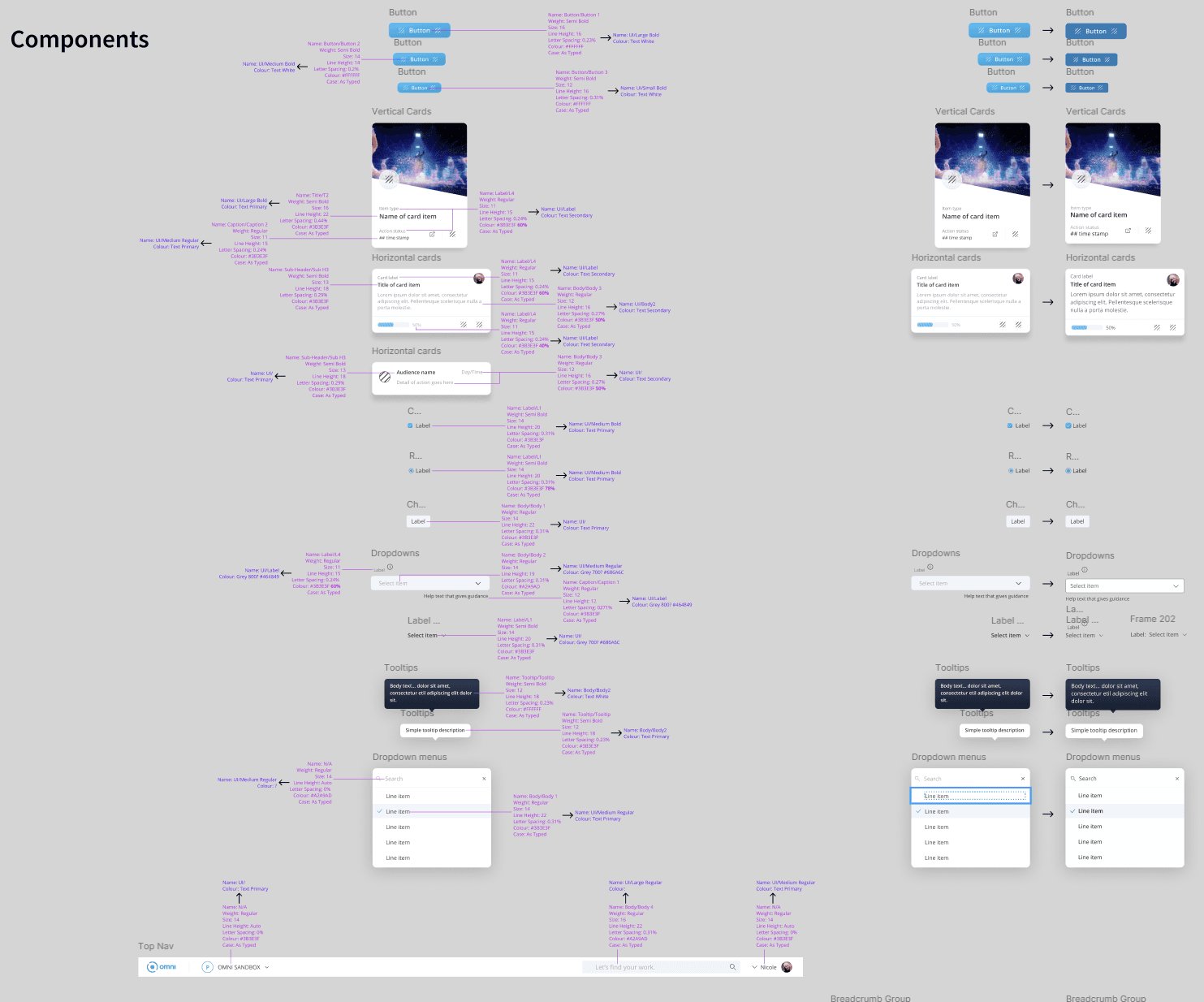
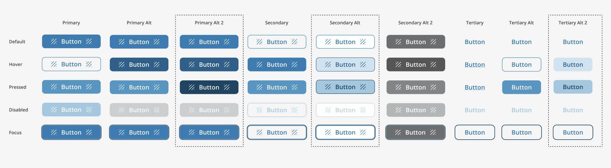
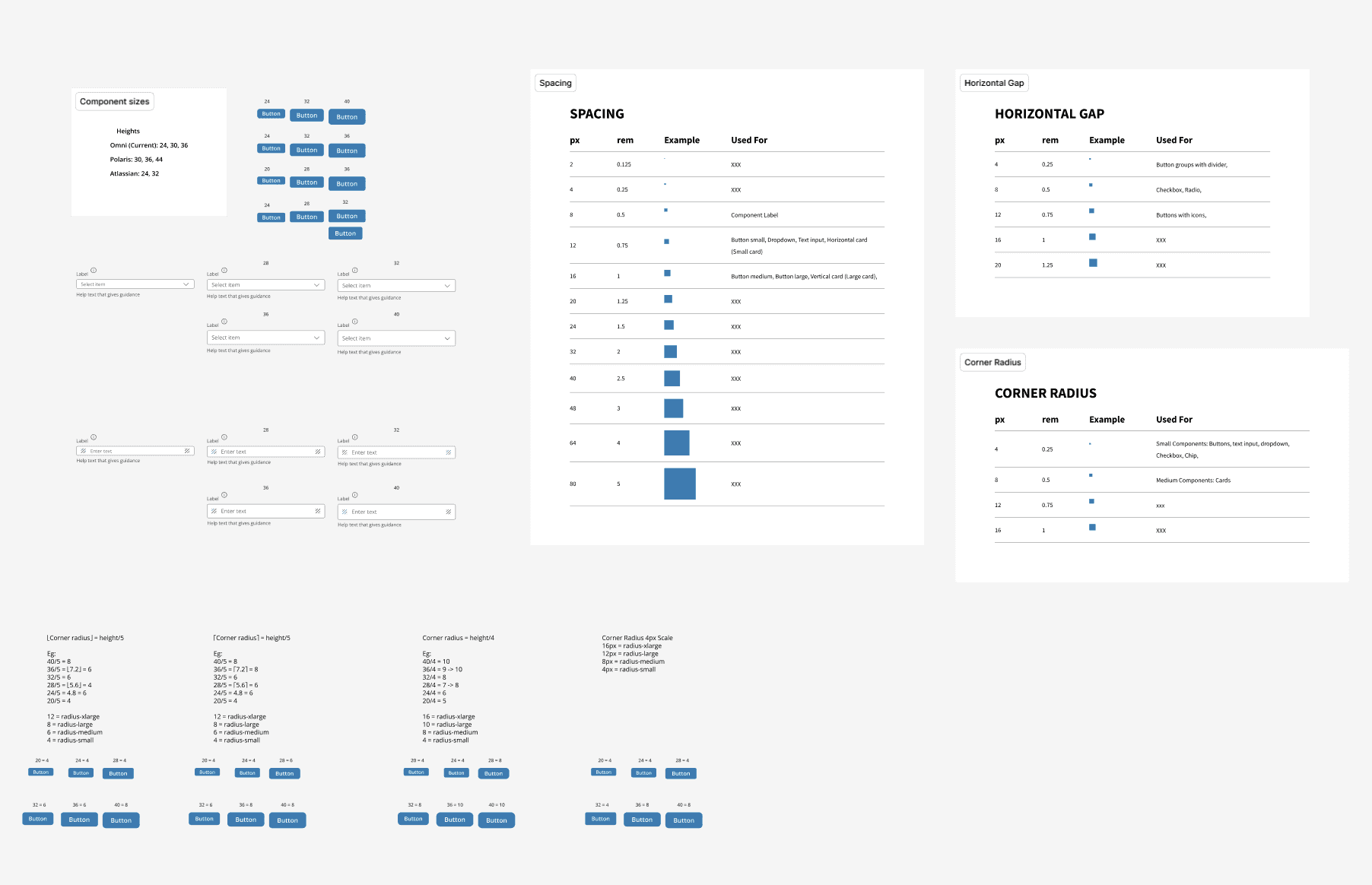
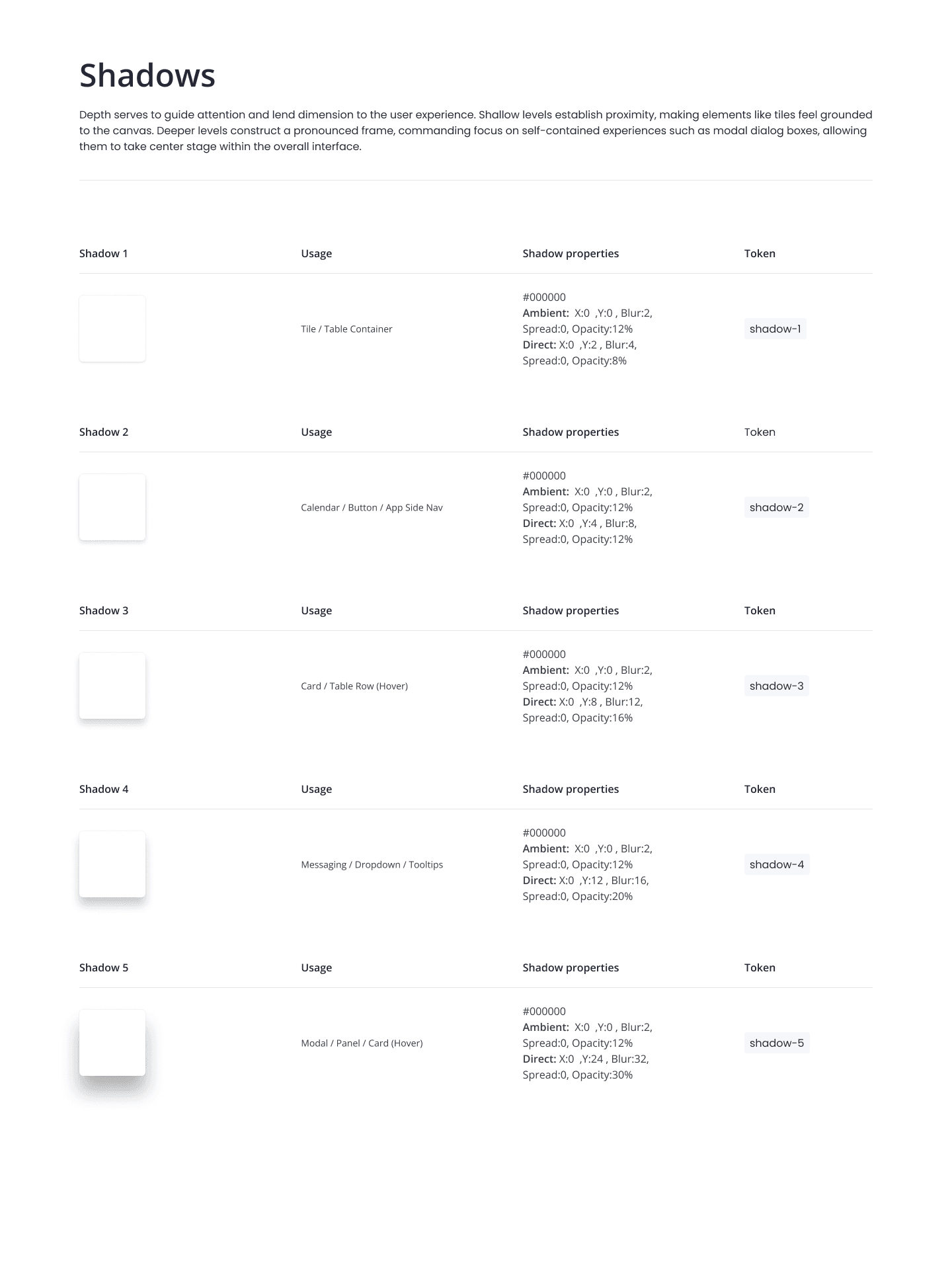
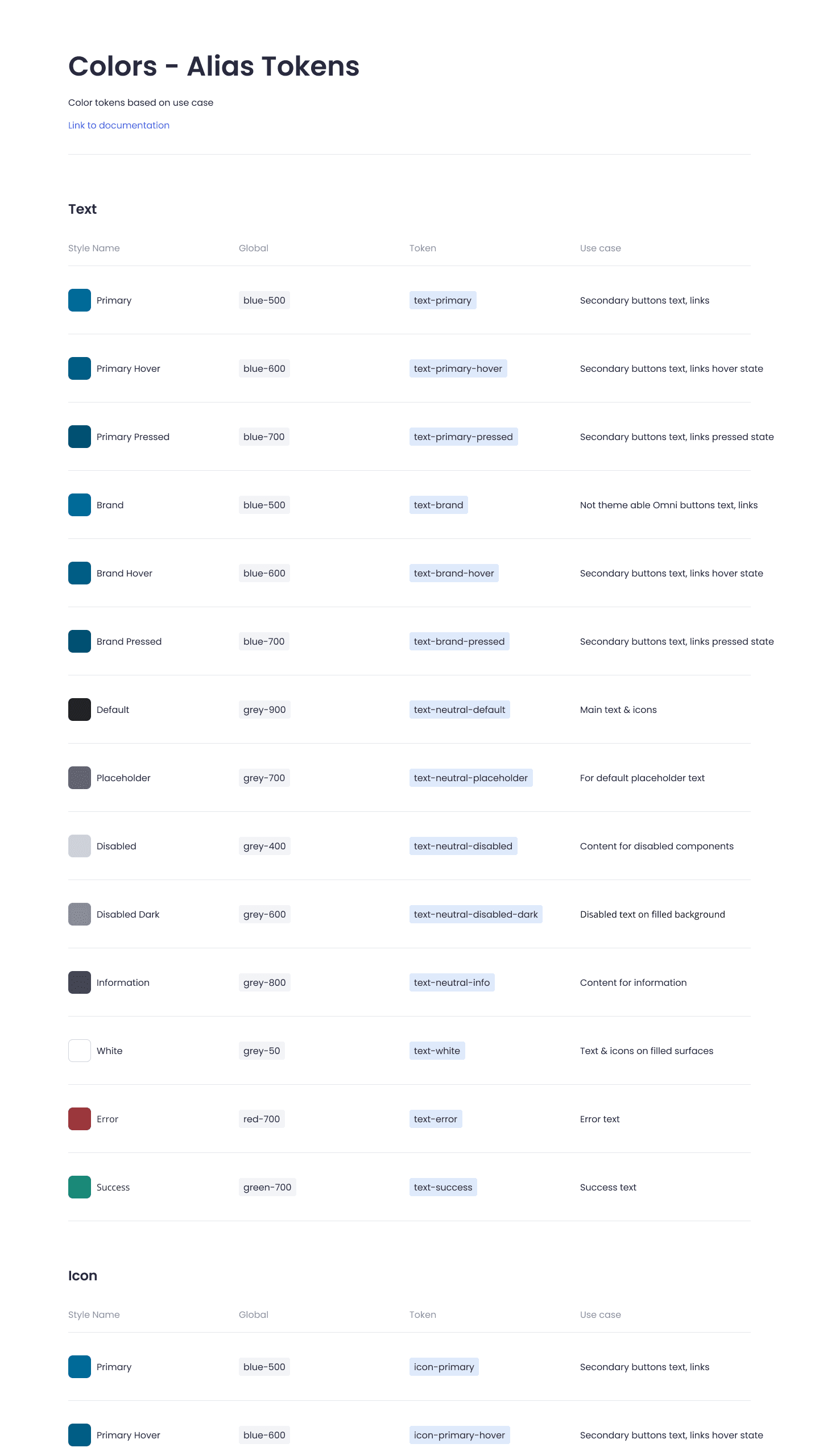
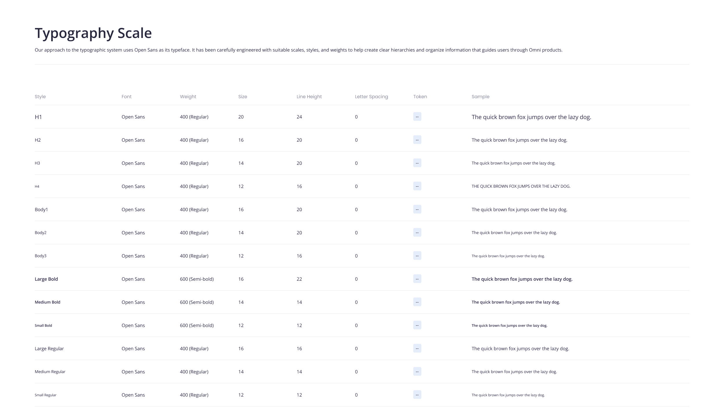
  • The design system began with establishing foundational elements e.g. colour palette, typography, iconography, and spacing. This would ensure visual consistency and scalability across all components.

  • By exploring and testing multiple variations of foundational elements we were able to refine a cohesive visual language grounded in usability and brand expression.

Foundations Results
  • Crafted a consistent brand-aligned visual system for Omni, which improved accessibility through UI and palette refinements.

  • A scalable foundation for all the components to be built upon which made creating the components easier, and allowed multiple designers to create components, knowing they would all have consistent look and feel.
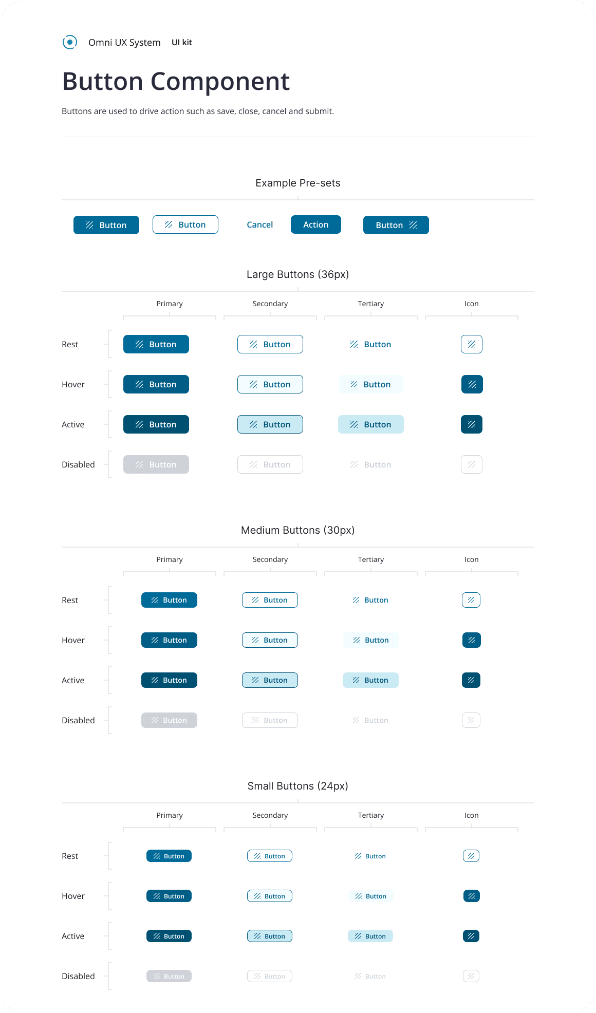
Design Execution
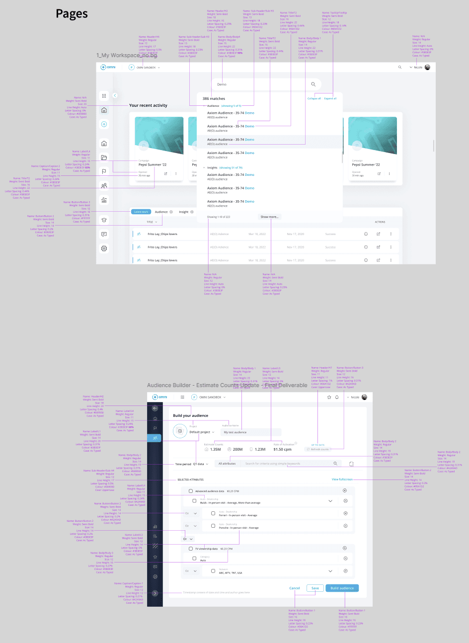
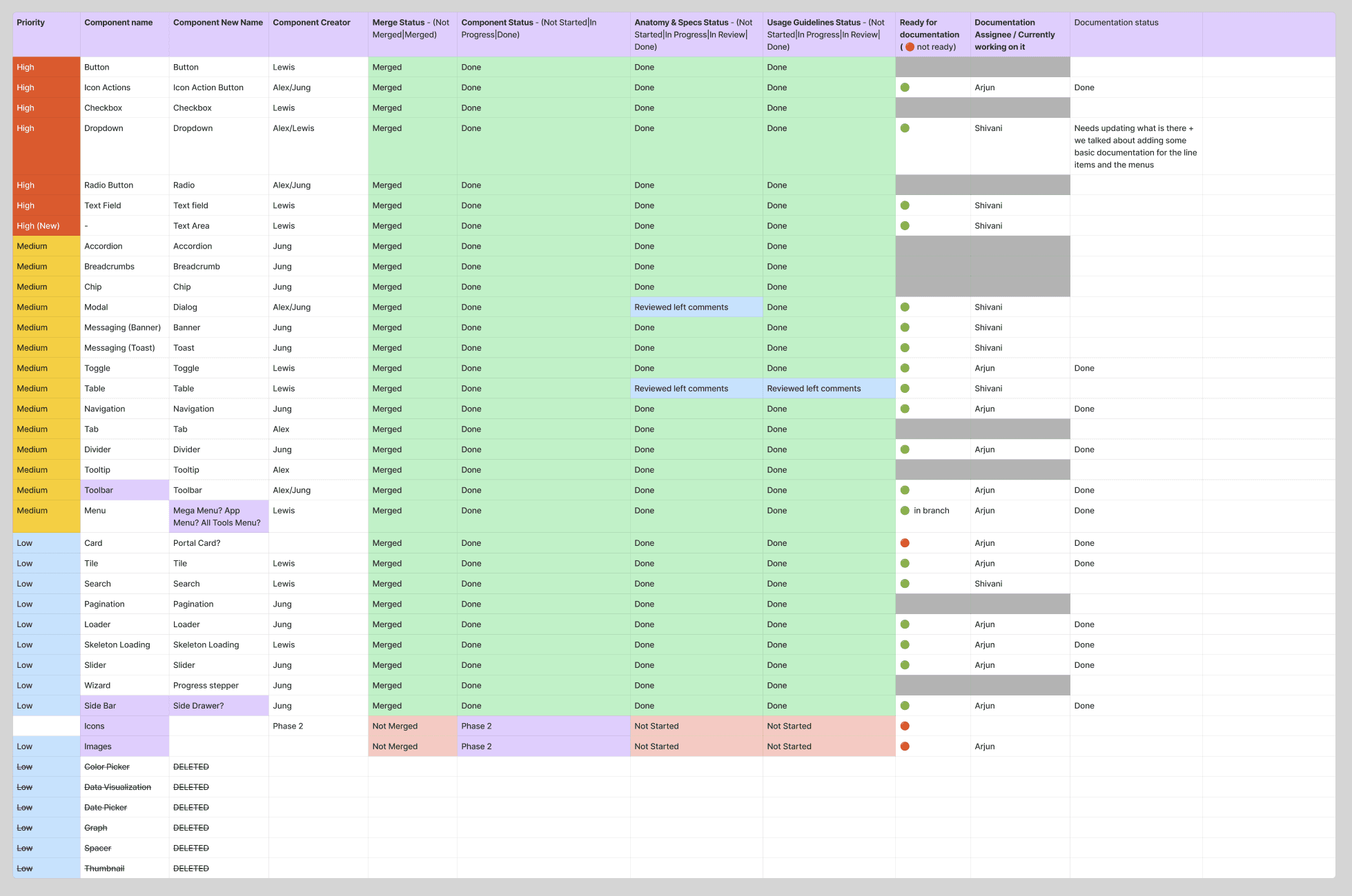
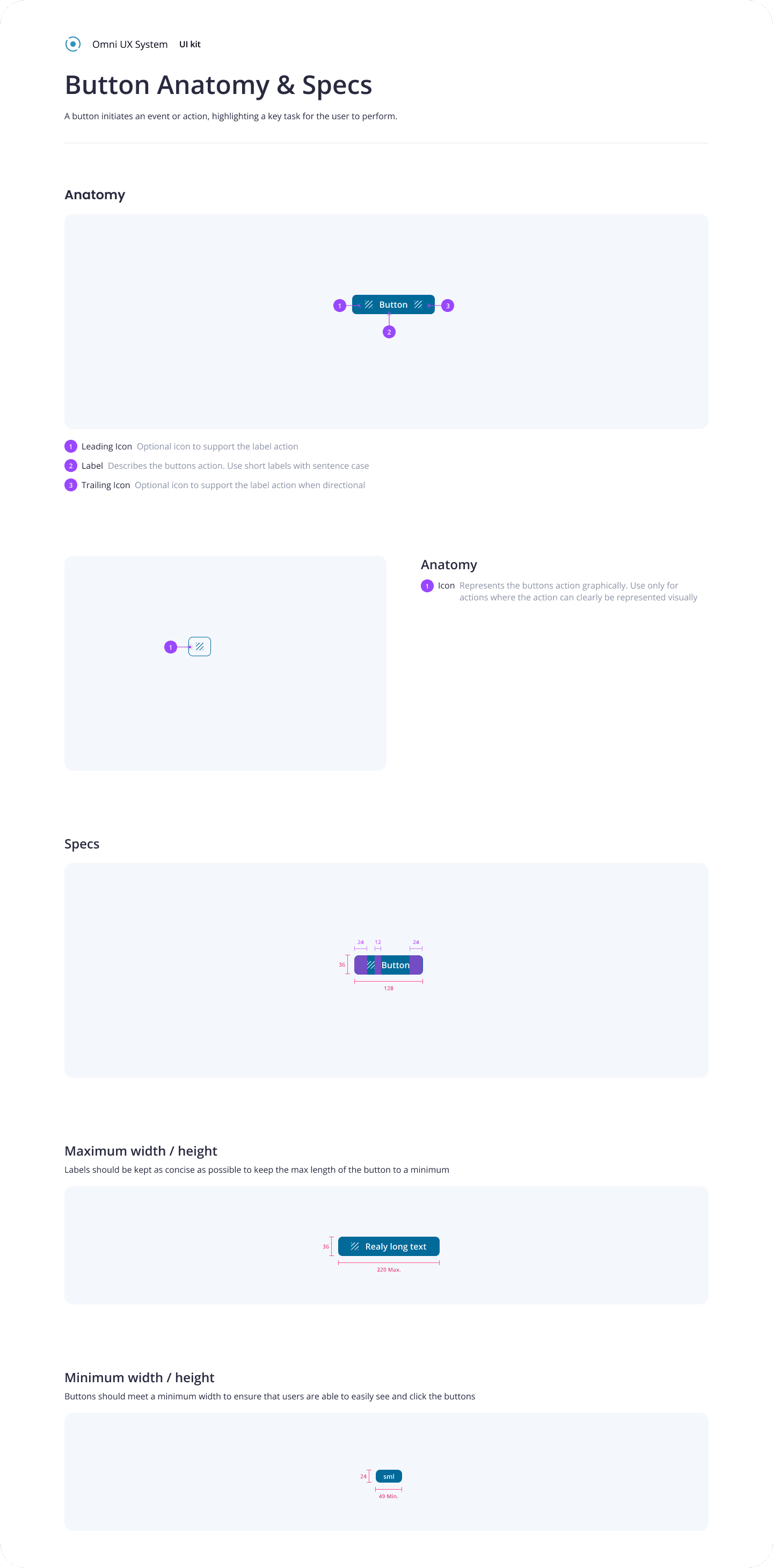
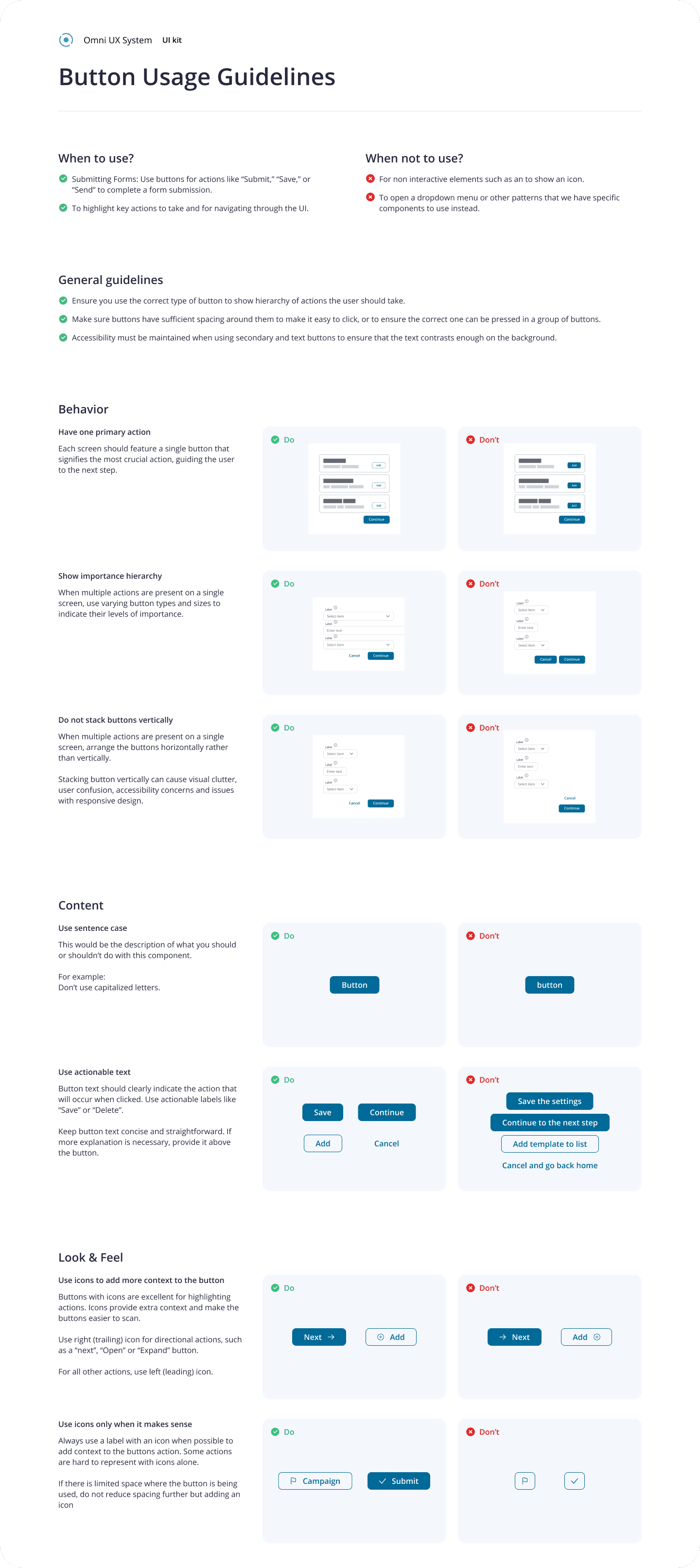
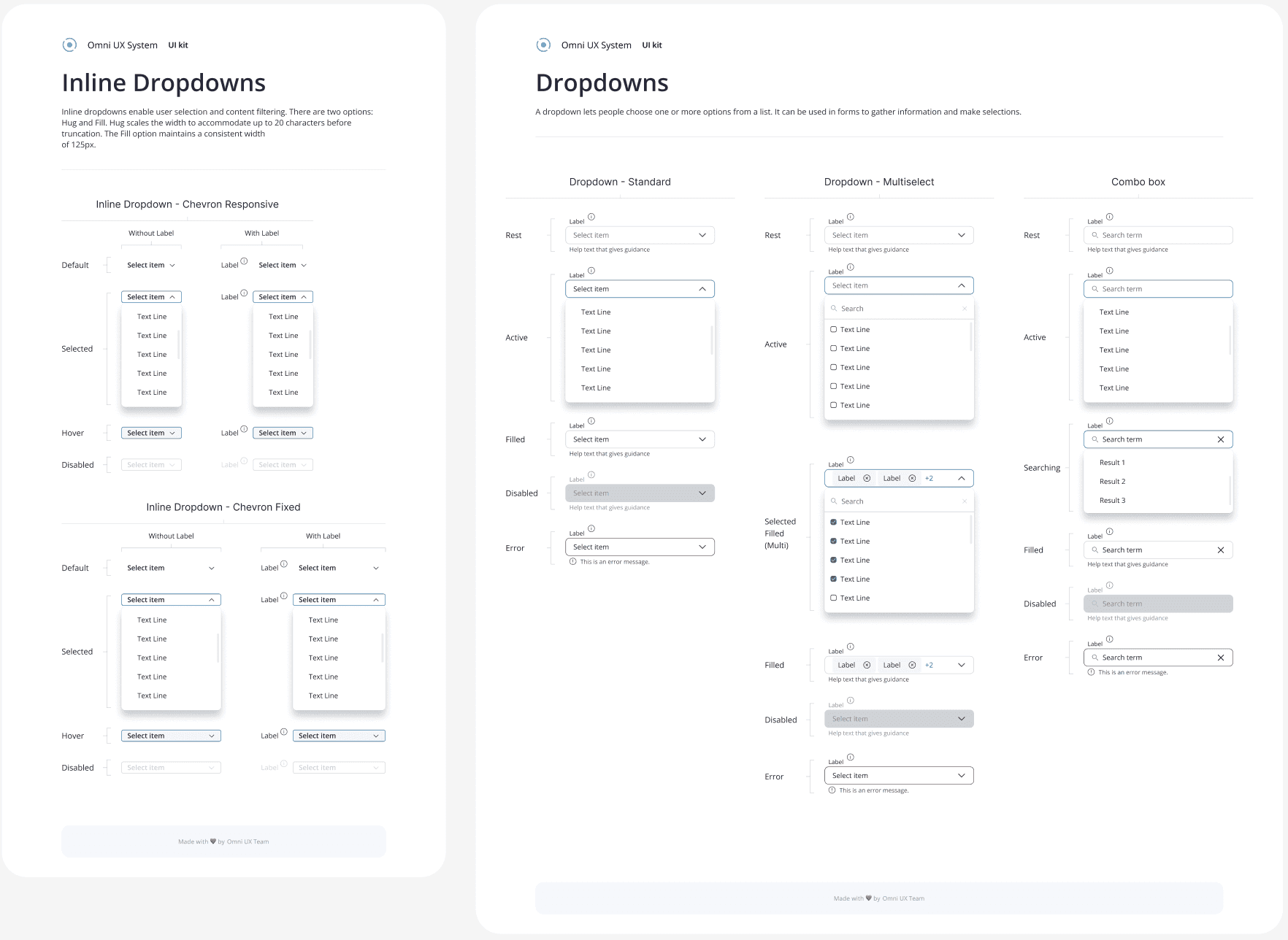
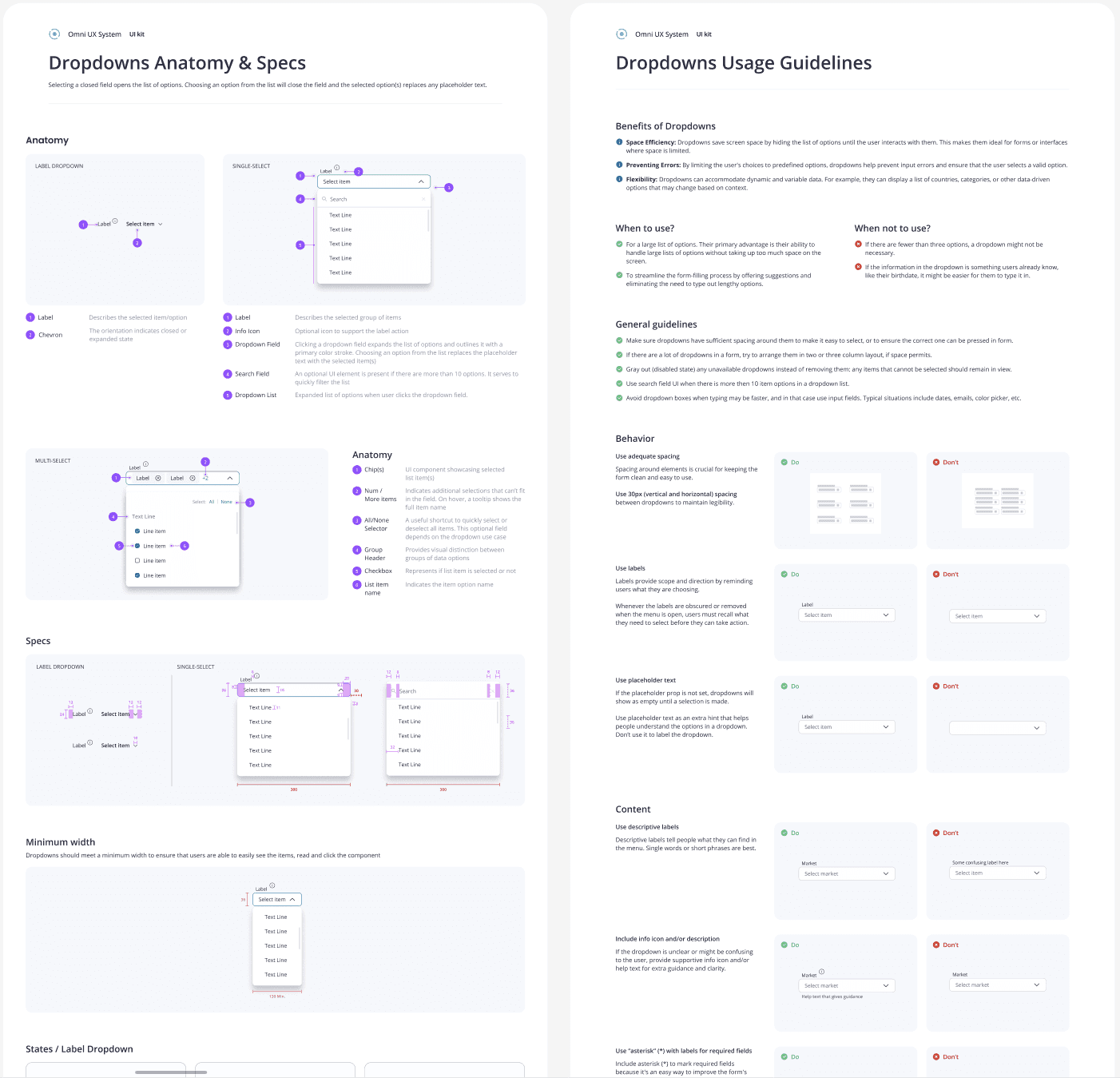
  • Worked through the component list, starting with the most important components.

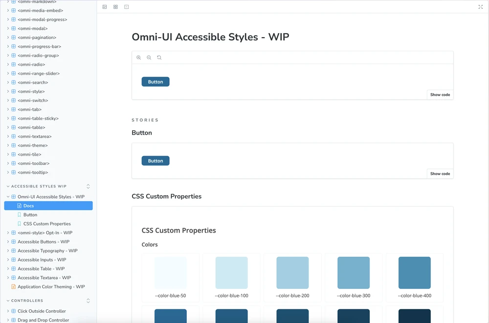
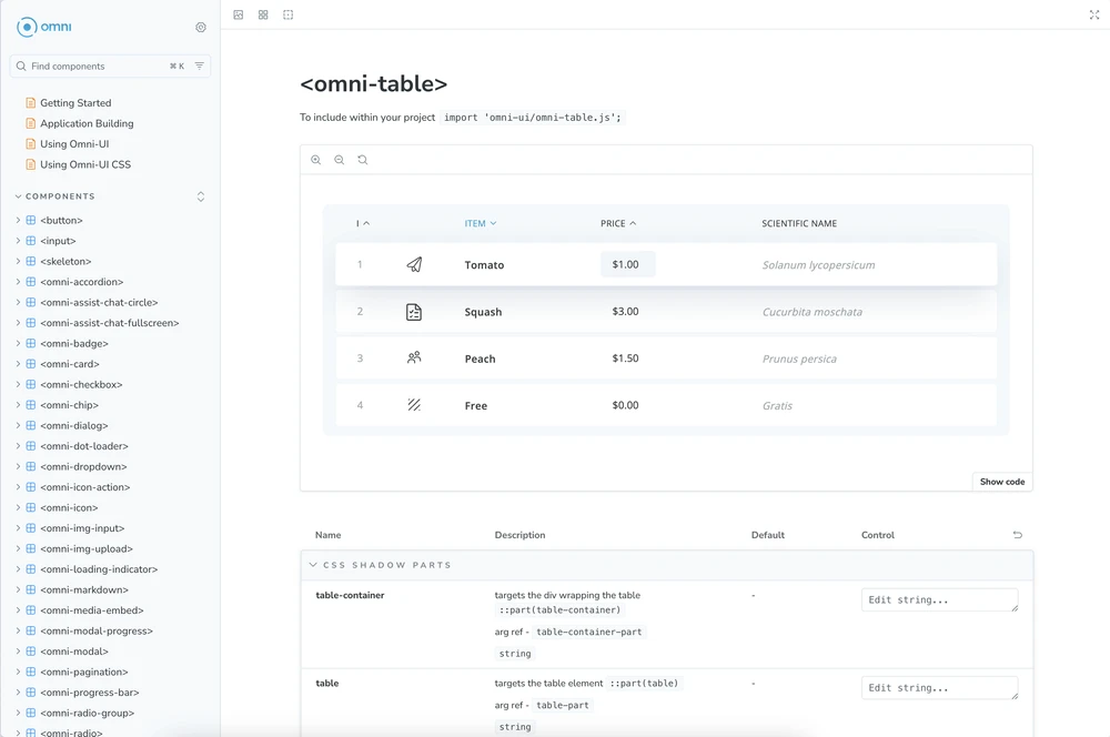
  • Created documentation for each component including detailed component specs, usage such as “do’s and don'ts”, accessibility guidelines and links to Storybook.

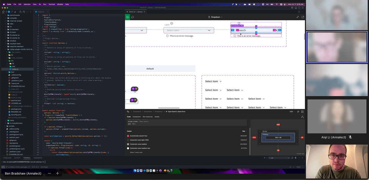
  • Regular design check-ins to guide the other designers on Figma component “best practices” and assist with any needs.

Development Implementation
  • Created channels for designers and developers to communicate and flag issues, as well as weekly meetings.

  • Enabled a streamlined design-to-dev handoff by combining Storybook’s live component previews and code snippets with Figma’s collaborative design environment.

Deployment & Adoption
  • Piloted the redesigned system with a single Omni product team, gathering feedback to address gaps in documentation clarity and component adaptability. These insights informed refinements to ensure smoother adoption across other teams.

  • Began a staggered rollout of the Omni Design System across all product lines to minimise disruption and fit into product timelines.

  • Presentations about both benefits and progress updates in both Developer and Product monthly forum meetings.

  • Provided targeted training sessions and onboarding materials to facilitate team proficiency and adoption.


Challenges Faced

  • Cross-team alignment: Securing alignment across Omnicom’s diverse product and development teams required proactive communications and sustained advocacy.

  • Transitioning Legacy components: Retiring outdated elements while maintaining continuity in development posed significant challenges.

  • Resource optimisation: Balancing the redesign initiative with ongoing Omni platform development required meticulous planning and prioritisation.

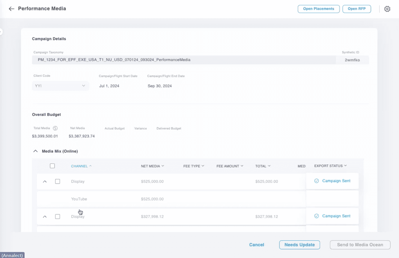
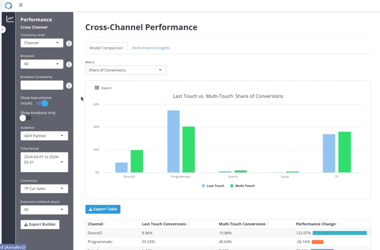
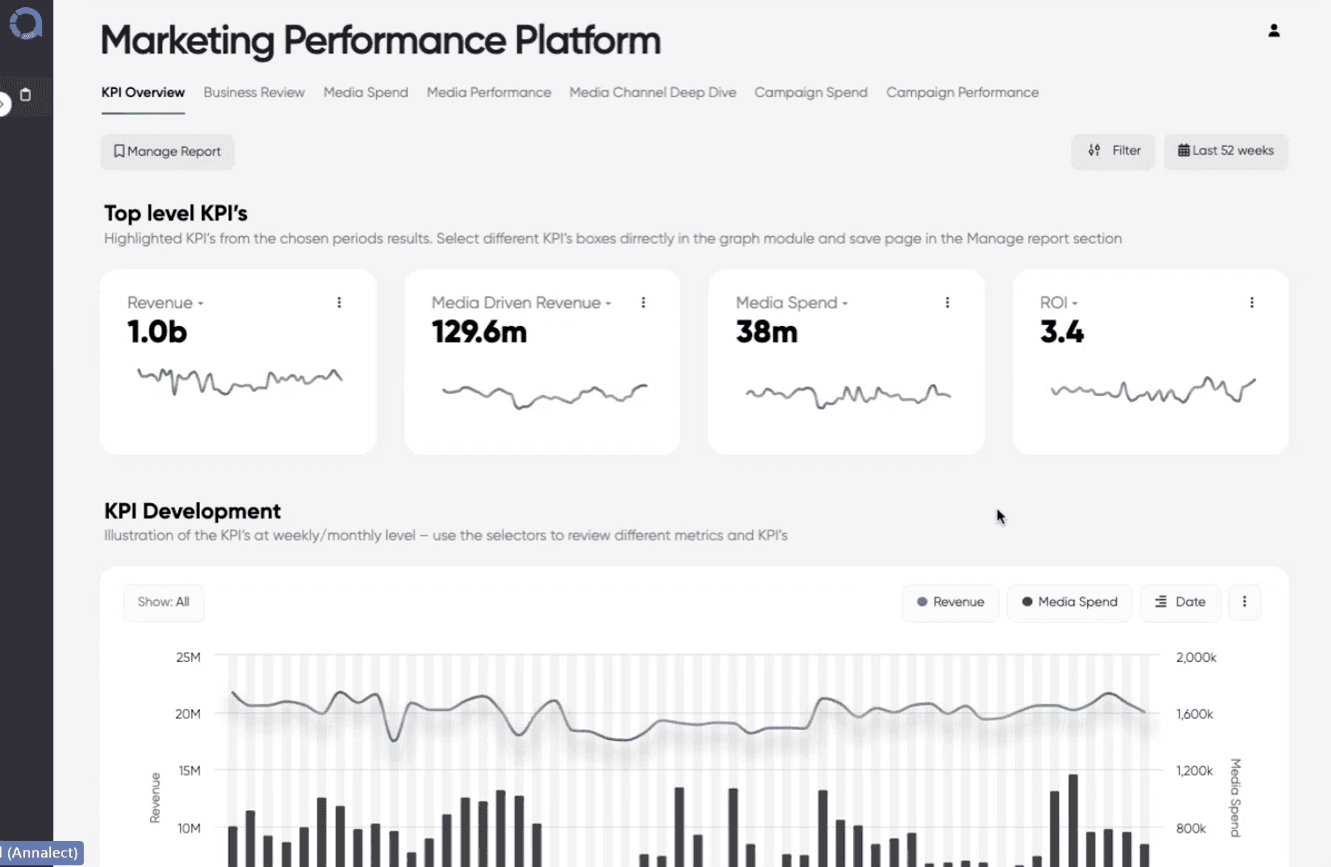
  • Size and scope: There were many Omni products so auditing and understand all challenges was difficult.


Outcomes

  • Enhanced consistency: the unified design language established a cohesive and intuitive user experience throughout the Omni platform.

  • Operational efficiency: The design-to-development cycle times decreased by 25%, accelerating the platform’s product lifecycle.

  • Scalable architecture: the modular Omni Design System allowed for rapid integration of new features, supporting agile development practices.

  • Collaborative synergy: Shared tools and comprehensive documentation reduced miscommunication and improved collaboration between designers and developers

  • Elevated accessibility: WCAG 2.1 AA compliance improved usability for all Omni platform users.

Other projects

Copyright 2025 by Lewis Knell

Copyright 2025 by Lewis Knell

Copyright 2025 by Lewis Knell